This blog has moved!

You will be automatically redirected to the new address. If that does not occur, visit
http://b2b.tellyjuice.com/blog
and update your bookmarks.

About Us


TellyJuice is a creative agency & video production company. Packed with creative juice, we are 100% good for you!

Thursday, 20 September 2012

Brainwashed?... No, Just Temporarily Distracted


For anyone that has seen Banksy’s Oscar nominated documentary 'Exit Through the Gift Shop', the figure of ‘Mr Brainwash’ (real name Thierry Guetta) will be a familiar one. 

From amateur film-maker to superstar street artist in 87 minutes. It’s a Cinderella story of how a French man met his idol, Banksy, who luckily enough allowed him to ‘document’ his artistic escapades in LA. Guetta then becomes a street artist in his own right, with the audience left to decipher the level of merit in his creations.


The film has caused much speculation in regard to its authenticity due to Banksy’s normally secretive nature. The playfulness that epitomizes his work would also lead us to believe that Guetta is perhaps just a manifestation of Banksy playing a very elaborate trick on the art world; either way, I’d urge you to see the film to make up your own mind as it’s a good watch.

2 years on and away from the film, London plays host to Mr Brainwash in his first solo UK exhibition. Housed in a suitably run down space, the Old Sorting Office on New Oxford Street, the exhibition comprises an assorted array of work from sculpture, to portraits, to a giant gorilla made of bits of tire. With empty phrases such as "Life is Beautiful" and "May The Art Be With You" appearing in various capacities you’re hard pressed to find anything conceptually substantial in the work. Mr Brainwash uses scale and bold splashes of colour to excite the eyes but there’s no real depth to any of the work, nor is there originality; Banksy, Warhol, and Hirst are all lovingly and shamelessly replicated.
 
Mr Brainwash - BowieMr Brainwash - Gorilla

Mr Brainwash - Painted HorseMr Brainwash - Giant Polaroid

Mr Brainwash - Micky Mouse

What you do have though is just a bunch of quite cool looking stuff. The giant Polaroid camera was cool. The giant toy cab was cool. The horses splattered with paint were cool… anyway you get my drift. 

So if you fancy seeing some over-sized cool looking stuff then you’ll have to head to the Harry Potter Tour at Warner Brothers Studio because the MrBrainwash exhibition is finished already.

Bad luck.

Wednesday, 29 August 2012

Hans Brinker: The Good, The Bad and The Honestly Terrible

First of all I’d like to apologise for the tenuous links in the forthcoming post, of which there are at least 2. They are all in a good cause I assure you, as if you haven’t yet seen the particular range of work I will later mention, I think you’ll be suitably amused enough to overlook my laziness. 

Disclaimer over and done with, I’ll get on with the shamelessness. Here it goes.

I’m off to Copenhagen! Hurrah! Very exciting for me, but "why should I care?" I hear you cry. Well, having purchased my extremely cheap Ryanair flights I am now faced with choosing from a particularly "nice" range of hostels. Do I want to pay £10 a night more to share with 5 people, or go cheaper and sleep in the same room as a whole 9 other people. Hmm, decisions, decisions... If only I was back in Amsterdam (tenuous link #1 : very vague geographical vicinity) where the only choice for broke 20-something backpackers is the Hans Brinker Budget Hotel (tenuous link #2 : accommodation type); and though it calls itself a hotel, it is most definitely a hostel. The same hostel my mum stayed in, in the 70s... 


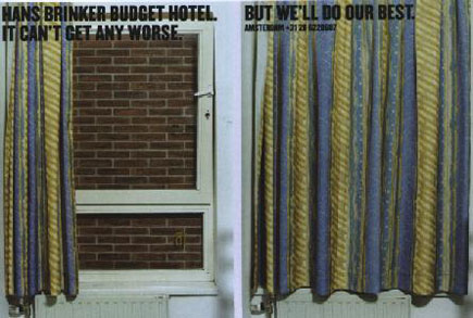
What sets this hostel apart from the reams of others in Amsterdam is their unique advertising. For 15+ years ad agency Kessels Kramer has been creating some incredibly memorable and hilariously honest posters, books and promotions for Hans Brinker, which in 2009 they chronicled in 'The Worst Hotel in the World'. 


The crux of each and every campaign is the simple, absolute rubbishness of the accommodation. 

The website begins:
The Hans Brinker Budget Hotel has been proudly disappointing travelers for forty years. Boasting levels of comfort comparable to a minimum-security prison.” 


A bold brand strategy but one that has paid off. It’s an incredible lesson in using humour and honesty to create brand awareness, and although they won’t be attracting middle class families to their doors anytime soon they have guaranteed their place as the number 1 stop for budget travelers to Amsterdam.

Of the portfolio of work produced by Kessels Kramer my favourite by far has been the “Accidentally Eco-Friendly” campaign from 2007. Check out the video:


…and the posters:


Some other memorable pieces from the book:


For a good laugh visit the website. You may even find yourself weirdly curious to check out the place. After all, it can’t actually be that bad, can it?

Friday, 3 August 2012

Simple Tips for Viral Marketing

Viral Marketing’ is one of those trendy phrases that has been floating around the Internet for the past couple of years, but it’s definition has often been murky. Is it simply a funny video, designed to be passed around offices up and down the country, or should it be used to define only those videos selling a product? Should brand it’s promoting be displayed loud and proud, or try and sneak it in when the viewer’s not looking? Well… these are all definitely questions…

Luckily the Viral Video Club approached us via Twitter and directed us towards a viral marketing event they would soon be hosting at Cargo in Shoreditch.
We arrived and, after propping up the bar for a few minutes, sank in to the over-sized beanbag chairs covering the floor and prepared to soak up all the knowledge from the line up of speakers. These included representatives from Unruly Media, ST16, EBuzzing, The Viral Factory and the king of the mash-up, Cassetteboy himself.

It was not a seminar or master class in the art of cracking a viral marketing campaign but more of an informal discussion around the topic. The speakers were good, apart from the slightly painful awkwardness and over-sized sunglasses of Cassetteboy – but we’ll forgive him because he makes a darn entertaining video.

I thought it might be useful to list some of the tips they gave us and these apply for any viral video content.

DO - Use Your Contacts


Any of your contacts could be good for distribution. You never know who just might know someone else, or is the cousin of someone’s brother-in-law’s aunt, so share share share - Within your own group of friends, contact lists and colleagues.

DO - Contact Influential Tweeters and Bloggers 


Often celebrities and influential members of the online community can be relied on to display your content to their many thousands of fans. Stephen Fry, Perez Hilton, and Lord Alan Sugar are amongst some of the most influential Twitter users online today and have a very high click-through rate.
Some of these celebs may be willing to do you a favour, especially if you already have a professional relationship with them, others however will definitely be hitting your wallets.

DON’T - Rely On Celebrities As Content 


Just because you have a great celebrity in your contact list does not guarantee a viral hit. For example when David Arquette & Courteney Cox featured in a viral campaign against domestic violence for The Ocean Park Community Center (OPCC), they came under a huge media and audience backlash who did not agree with the tone at all.


The moral of the story, make sure your content is targeting the right audience and tone before even considering which celebrity you should shoe-horn in.
Also take the Old Spice adverts for an example, no celebrity endorsement was needed but it currently has over 42 million views!

DON’T - Think You Have To Be Funny


Some great video pieces have been produced that raise awareness for different subjects, such as this one for Sussex Safer Roads. It is visually beautiful and thought provoking without needing humour.


At the end of the day it’s about getting a reaction from the viewer., do you want them to interact, laugh, cry, be amazed – probably you want them to buy something too. Granted, humorous videos are often the post popular and highly shareable but videos featuring public stunts and great cinematography can do just as well. And it goes without saying that viewers love a good shock proposal or surprise wedding too…

DO - Provide Value For Your Viewers 


People often share videos because it represents a viewpoint of character trait that they want others to know they have.
So if a viewer shares a funny video, they want their friends to know that this is their type of humour. If it’s a Cassetteboy mashup of David Cameron, then it is likely that they dislike his style of leadership. Often the most shared videos are large scale stunts, such as the Sony Bravia (Bouncy Balls) advert or public flash-mob style events, like Push For Drama.
The sense of disbelief you feel when watching them, the ‘omg-I-can’t-believe-they-did-this!’, makes you want to pass it around so others can also witness the epic feat and validate how they did it or whether, indeed, it is real.

DON’T - Limit Yourself On Time 


Commonly it’s thought that virals should be short and sweet, although it’s maybe good to think under 2 minutes, if you have a great idea that needs more time then hopefully the content should still keep viewers engaged.

Take for example one of the top viral ads of all time, DC Shoes: Gymkhana, which runs to 7 minutes 42 seconds, just enough time to make a cup of tea.


I realise there will always be exceptions that break these rules, but it's about trying different techniques and different types of content until you find a formula that works for you. And don't be afraid to fail - if you don't try, you can't succeed.

Keep watching this space as we continue to delve further in to the muddy waters of viral marketing!

Thursday, 26 July 2012

Transmedia Heaven: Beginnings

After some effort and thought over the weekend, has one our fictitious characters, Lesland, reached 30 likes on his Facebook fan page


A small milestone, but none-the-less we have now unlocked the insights feature on Facebook (you must have over 30 likes) so we can see who is consuming what, when and how frequently. We can delve into the darkest places of our characters fans base, yes all thirty of them, and analyse their media consumption rates. I feel like I am working at MI6 and have infiltrated a cell… of some description.

Ladies and gentlemen we have ventured into transmedia! And we're going to keep you updated on our experiences throughout the process, the things we learn, the things that don't work so well, and everything in between.

For those of you who don't know, transmedia is the technique of delivering a story or creative idea across multiple digital platforms and formats. The idea is to create content that permeates the audience's daily lives so they can engage with it on varying levels and using different platforms, and in this way be a part of the action, and in many cases even control the flow of the action.

We thought long and hard and came to the conclusion that this transmedia world is so new that if you have imagination, and determination, you can make an impact. We have listened to and read so many opinions on this topic and the average attitude is that the whole idea is so new that lots of things are still untried. But that’s good enough for us, we have lots of ideas that we want to build on and share. This will enable us to start to learn and perhaps share the process and results with our clients in the future.

On our research travels we have found some wonderful and unique examples people embarking on their own transmedia journeys. A nice example is Screw*d, a reality-based campaign for Craftsman. It featured Alan Weischedel, a tool-clueless guy on a mission to become a real handyman. Weischedel’s immediate goal was survival, he was put in situations and environments he had no experience with and was set challenges. It was streamed live and viewers were able to give suggestions, via Twitter and Facebook, to help Alan out of various scrapes or give information on what tools would be useful to build things etc.


An amazing thing happened today. We uploaded a video to Lesland’s fan page on Facebook and more people saw it than Lesland has fans! I know – incredible. It was ‘available’ to 42 people, he only has 36 fans. This means that if we create great, short, witty, grab-you-by-the-throat videos, we will grow an audience! Creator and audience in some kind of symbiotic relationship.

We are at the point of deciding the level of interaction with our new audience. All 40 fans of Lesland have liked him for some reason or other. How much will they want to take part in his life and adventures? What will the level of engagement be?
How can we get people to enjoy taking time out to spend with a fictitious person?? What do we know about these people? You might think very little at this point. Well not exactly. We know that these people are happy to press the like button and sometimes they will add a comment to a piece of video. Can we engage them in a story where they can be submerged in to our world?

The character Lesland is a Police Community Support Officer, a PCSO. Whilst ‘on duty’ he found a suspicious-looking single glove, so he placed a picture of the glove on his fan page and asked if anyone had any information about the owner or the suspect circumstances regarding it’s abandonment. Well blow me down! People bought into it. They added to the story of the glove’s owner, helping us to take the story in new direction. One person even uploaded an image they themselves had created to add to the digital silliness. The power of story reached out with its smooth porcelain hand and said “this way my child to the digital tomorrow”.
 

Not only do you get a response from real people it is actually fun to do. You feel like you are in the operation room of life. An altered ‘anything can happen’ life. I want more…

Thursday, 19 July 2012

Time For Some Art

Whilst passing a shop window in Prenzlauer Berg on a recent jaunt to Berlin, I discovered ‘Standard Time’. A large TV screen visible through the glass had attracted a crowd of tourists all laughing and pointing.  On the screen was a large seemingly digital clock. ‘What’s so amusing about the passage of time?’ I pondered, but low and behold: this was no ordinary clock. This was in fact ‘Standard Time’ – an art project by Mark Formanek, recorded on film, lasting exactly 24 hours.

Standard Time - http://www.standard-time.com

In Standard Time, the lines that make up each digit are huge planks of wood, held by bolts and brackets. As every minute passes a team of workers enter, equipped with hard hats and ladders, to move the planks into their next position. These minute-by-minute changes continue through 24 hours. Though edits are visible, the sun does rise and set at the right time, proving that this art project was created around the clock (excuse the pun).

The anticipation of waiting for each minute change is tantamount to enjoyment for the viewer, and on this occasion in Prenzlauer Berg the assembled audience let out a giddy cheer when the clock ticked on from 22:59 to 23:00. On scurried the yellow-hatted team, ant-like next to the huge numbers. They had barely finished one change, when the next was due.

You can see the overall effect in this time-lapse video:


You can also see a behind the scenes of Formanek's more recent version, constructed in Rotterdam, in which Standard Time goes digital.

Though this work can be categorised as ‘performance art’, its practical use as a working clock has made it commercially successful. Standard Time is available on DVD and as an App for iPhone and iPad. Admittedly, my first thought on seeing it was ‘Where can I get a copy?’ though Formanek would perhaps argue that this was never intended as a commercial venture. His artistic explanation on the Standard Time website relates more to the passage of time than sales in the App store. He says: 

‘…this film is much more than just the recording of an action, the recording of something that has taken place in the past; it is also a clock. A clock for use right now and in the future which, as each day goes by, extends further into the past, but is still up-to-date and punctual.’ 

As a bit of a hippy, what I enjoy about this piece is its inherent theme of ‘Togetherness’. Standard Time involved 70 workers, and with a digital clock face measuring 12m x 4m, it was essential for each team to communicate with one another and work together to meet their timely deadlines.  

Standard Time is filmed in Skulpturenpark Berlin_Zentrum, with camera locked off for a wide shot. Berlin’s eastern bloc architecture can be seen in the background, punctuated by ball and spike of the TV Tower. The inclusion of a famous landmark suggests that this is not a generic work of art, but more precisely it is a German work of art. Formanek is putting Berlin on the map for its culture and boosting the German capital’s reputation. Over time the public will associate Berlin less with war and segregation, and more with creativity and unity. And for that reason Standard Time gets a big TellyJuice thumbs up.

Tuesday, 10 July 2012

CowBird - Putting the Feeling Back in to Social Media

Working in a place like ours, from producers to designers, you are dealing with stories everyday and trying to communicate them in the best way possible through video, motion graphics and scripting. Throughout my day I'll always look to Vimeo to see how other people are telling their digital stories too, whether personal or professional.

The lasting effect of an engaging narrative can be rare but is always one that I want to share with others, so you can imagine my delight when I came across this little gem - CowBird.com
A site dedicated to very short personal stories and not just one off statuses. There's a different lead topic everyday and anyone can contribute. Mostly they are remarkably compelling and heartfelt given their length and the writer's anonymity.

The brains behind the site, Jonathan Harris, talks about his motivation to set up CowBird.
He's got a pretty interesting back-story too which he doesn't mind sharing.


Harris states that the idea came about on his 30th Birthday. He began running an experimental project, posting photos he thought were interesting to his personal site, number27.org, and adding an accompanying short story about each one. This small project then took flight and became CowBird.

Harris is also the designer behind 'We Feel Fine' which scans blog posts for occurrences of the phrases "I feel" and "I am feeling", the idea being that in recent years, with the boom of social contribution sites such as Twitter and Facebook, people are posting increasingly distanced and unemotional content to the web. 'We Feel Fine', and now Cowbird, attempts to return to the emotional core of online social diaries and the digital footprints that we leave.

It's an incredibly beautiful site simply on a stylistic level but I urge you to check it out for some soul baring snippets.

Wednesday, 6 June 2012

The Queen's Diamond Jubilee

TellyJuice were approached to communicate the scale and excitement of the Jubilee in a way that would appeal to a broad international audience. TellyJuice conceived the idea of an invitation that opened up to reveal the events planned for the upcoming celebration.
The promo was created entirely in house by TellyJuice’s talented design team using Cinema 4D and After Effects.

Broadcasting in 140 countries worldwide.

Take a look!